
A price list in one image
September 10, 2026
Screenshots show the Russian-language interface.
A current price list for stories or a social media post is usually put together by a pro in one of two ways: rebuilding the image from scratch in a third-party editor every time a price changes — or simply taking a screenshot of the service list in the app. Both work, but the first takes time on design, and in the second the frame ends up showing the app’s interface rather than what you actually want to show a client. Talenza now has a separate screen for this: the price card builds itself, right in the app.
The card builds itself, no graphic editor needed
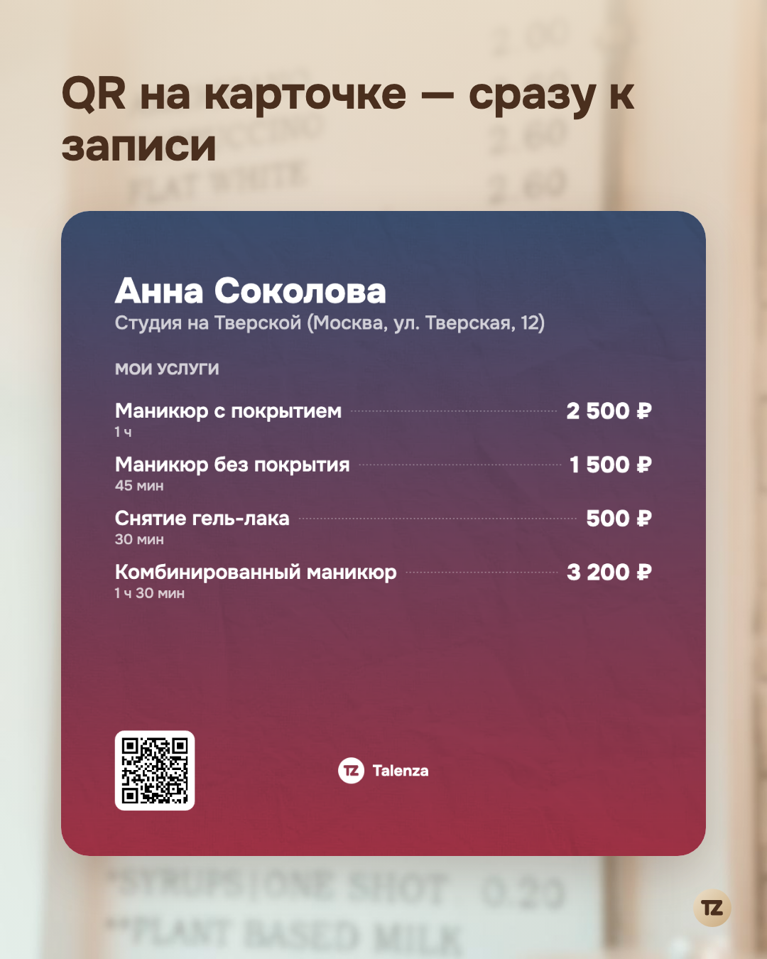
A “Price list export” button has appeared on the “Services” screen. It opens a separate screen with a live preview: a branded card on the canvas — the pro’s name, the workplace address, a list of services with prices and durations — updates instantly, with no separate “generate” step. Then comes the “Share” button, and the finished image goes out the same way as any file from a phone: on the web through a regular share or download, in the app through the system menu, because the web way of sharing a file doesn’t work there. There’s no longer any need to rebuild the card in a third-party editor whenever a price changes — it always reflects the current list of services from your dashboard.
Three formats — not one stretched screenshot
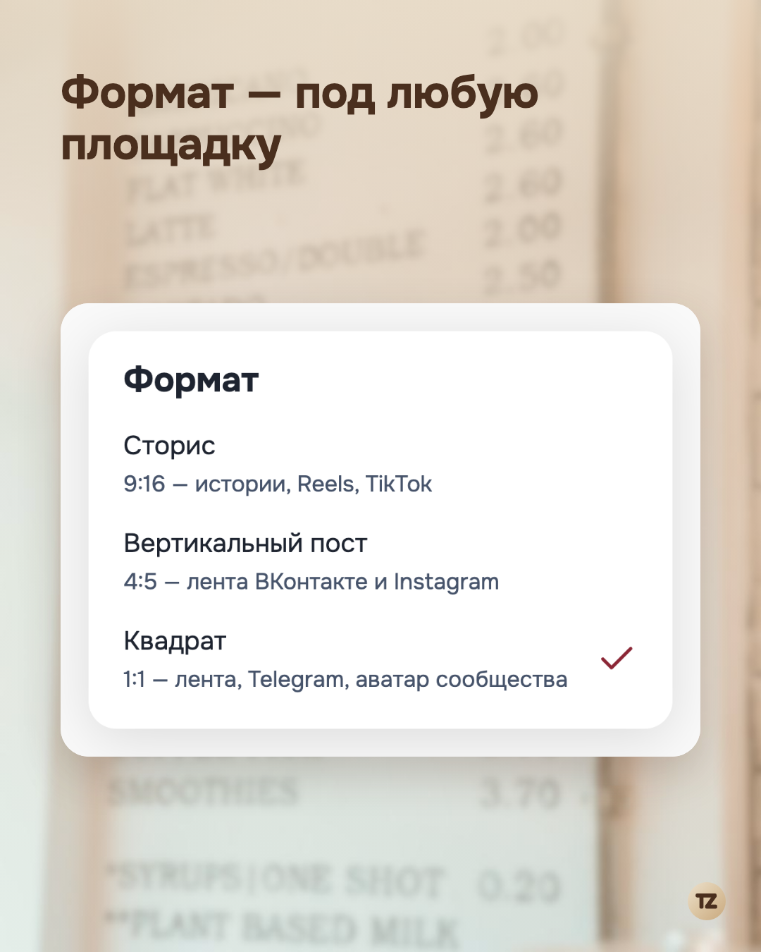
The card comes in three ready-made formats: a story (9:16), a vertical post (4:5), and a square (1:1). The difference isn’t only in proportions — the margins and font size are calculated separately for each format, so the card doesn’t look like the same frame cropped or stretched to the needed size. You choose the format for the platform where you plan to post the price list: a story for Instagram and VK, a square for Telegram or a community avatar.
The QR on the card leads straight to booking
In the corner of the card there’s not a placeholder logo but a working QR code to the pro’s public booking page. A client who saw the price list in a story or post doesn’t land on a general website or in a “how do I book with you” chat, but straight on a page where they can choose a service, date, and time. The path from “saw the price” to “booked” is shortened to a single scan.
A long list lays itself out across several cards
If a pro has many services and not all the lines fit on one card, the extras aren’t cut off and the font isn’t squeezed to unreadable — the list continues on the next page, with a page mark at the bottom. You don’t have to decide which services to show and which to hide just to fit: you post the entire price list, just on several cards instead of one.
The card’s settings — palette, format, what exactly to show — are saved not on the phone but on the server: switch devices or reinstall the app, and the price list looks the same as you set it up last time, with no need to set it up again.
The bottom line is simple: what used to be solved either by spending time in a third-party editor or by a crooked screenshot of the interface is now one screen inside the app and one “Share” button.