
Beautiful is a feature too
July 28, 2026
Screenshots show the Russian-language interface.
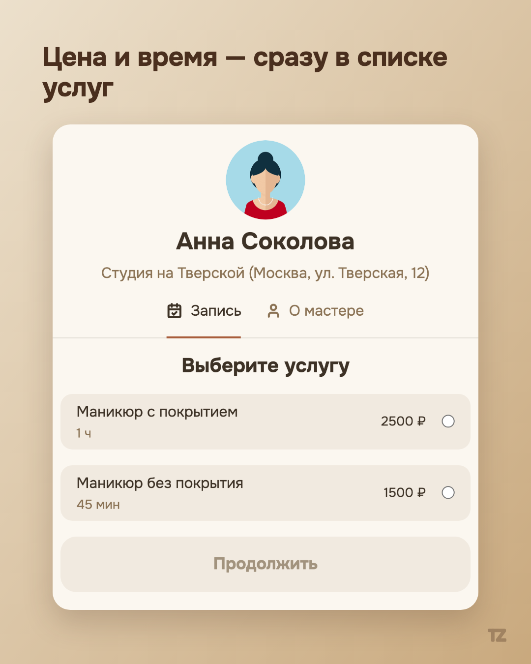
Most online booking forms look like a form at a clinic: gray fields, a captcha out of nowhere, registration for a single service a person will order once in their life. We decided that booking a pro doesn’t have to be such an ordeal — and rewrote it from scratch, starting not with the backend but with what the client sees after following the link.
Three steps, not ten fields
The public booking page works like this: choose a service → choose a date and time → leave a phone number. That’s it. If the client has been to this pro before, not even a password is needed — Talenza recognizes them by number and skips the extra step.
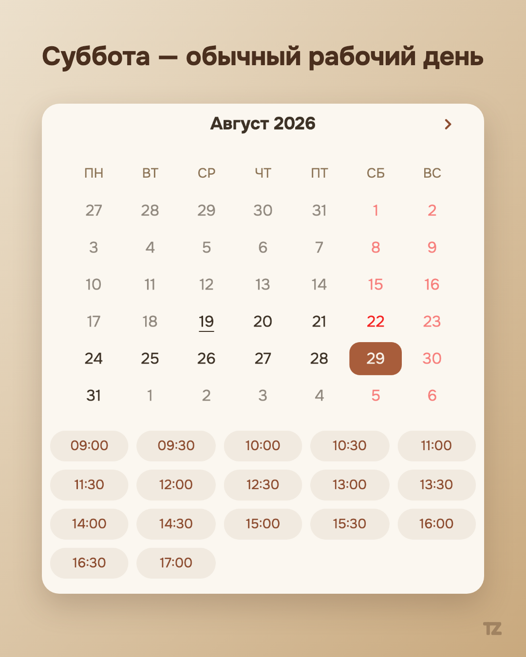
The difference isn’t only in the number of fields, but in how they’re filled in. The date and time are chosen by tapping the calendar and the grid of free slots — not by typing text or going through dropdown lists. The phone is entered with the mask +7 ___ ___-__-__, not in a bare text field where it’s easy to be off by one digit and not notice.
There’s no captcha and no password on this path. That isn’t an oversight in security — a client’s account doesn’t require a password at all: the phone is confirmed with a code at the first booking, and at subsequent ones Talenza simply recognizes the number.
The look is part of the solution too
The second part of the thesis isn’t about form fields but about how it looks. We deliberately moved away from the cold “boxed” interface of a typical SaaS product — in favor of a warm beige palette and a recognizable glyph instead of a generic placeholder logo. A pro who sends a client the link to their booking page sends it in their own name — and wants it to look neat, not like a form from a corporate CRM.
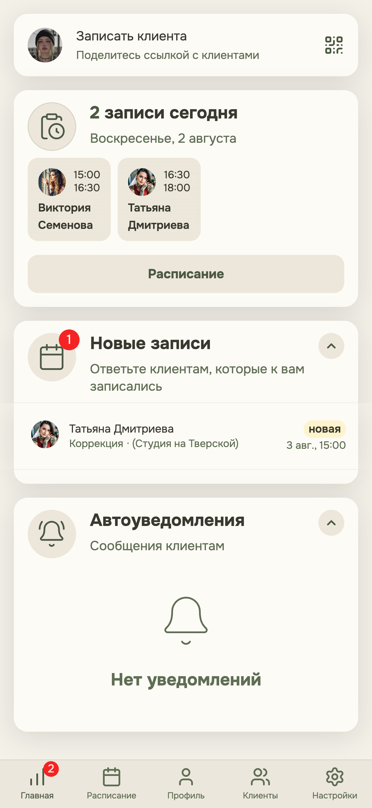
This isn’t aesthetics for the sake of aesthetics. A form you’re not embarrassed to bring a client to is a form people actually book through, rather than closing the tab halfway.
The dashboard tour is part of the first impression too
The pro’s dashboard works on the same first-impression side. When a pro first enters it, a short interactive tour greets them: a few steps that show where to find new bookings, the booking link, the client card, and the other main screens. The tour can be closed at any moment, and if you forget something you can reopen it in the settings, with no need to remember on your own or write to support.
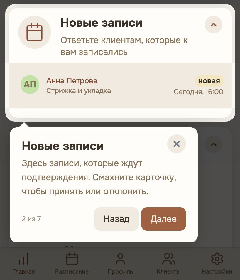
Neither the booking form nor the tour solves a technical problem in the narrow sense — they solve a simpler and yet more rarely solved one: making sure neither the client nor the pro feels awkward about the interface they use every day.