
How we got the color theme wrong — and fixed it in a day
August 20, 2026
Screenshots show the Russian-language interface.
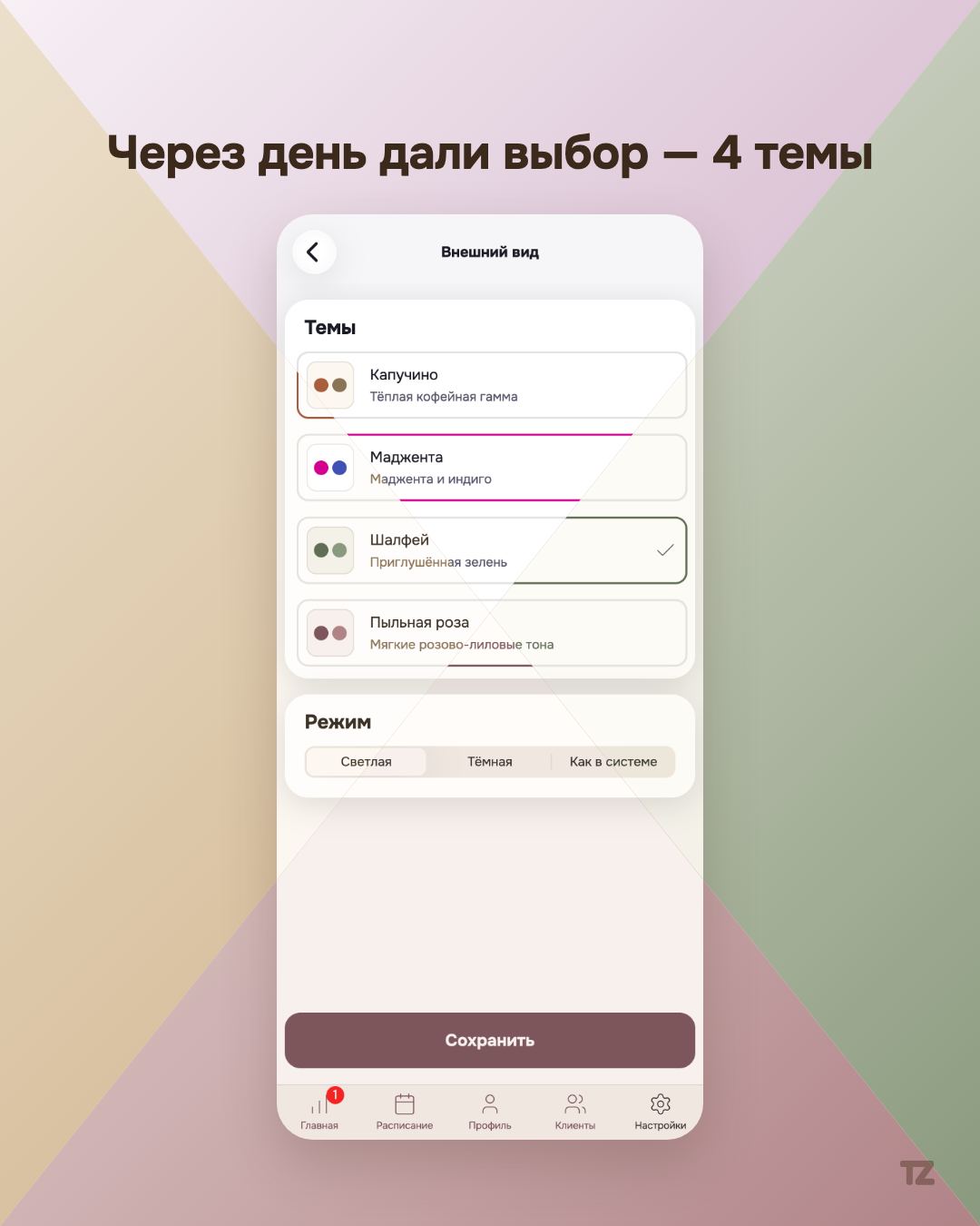
Not every product post is a pre-planned script. This one is about a real decision we made without thinking it through, and about how quickly we came back to it after feedback.
One theme for everyone
When Talenza gained the ability to customize the look of the dashboard, the first palette we added was “Magenta” — the second theme after the default “Cappuccino.” We rolled it out without asking, beforehand, the people the look is meant for in the first place.
The feedback was direct
The reaction came quickly: the palette turned out to be too one-sided and didn’t resonate equally with all pros. It was an honest signal that “one extra theme to choose from” is not the same thing as “a choice.”
The next day — two more palettes
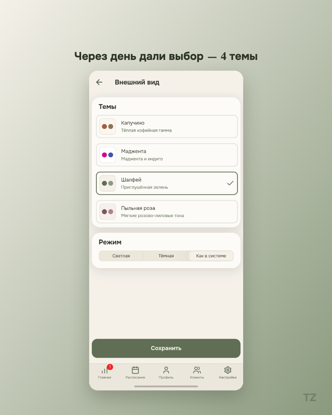
The day after “Magenta,” “Sage” and “Dusty Rose” appeared in the app — two more palettes in addition to the existing ones. In total, the choice grew to four color themes instead of one. The decision was made and implemented quickly — not because the task was simple, but because we didn’t want to delay our response to direct feedback.
We keep expanding the list
We’re not stopping at four themes. Users have already asked for additional palettes, and the choice will keep growing — with no promise of specific dates or specific new themes, but with the same principle: listen to what pros say and not take longer to respond than necessary.
Why we’re telling you this at all
Admitting out loud that we rushed isn’t the most obvious move for a product blog — usually only the successful decisions get told. But how quickly a product responds to feedback is also part of what it is for a pro who uses it every day. It isn’t a one-off stunt for the sake of a single post, but how we usually work.